Why world maps fool us about the size of countries
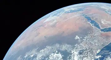
“Which is larger?” On area questions, many Comparo players trust the picture of the world map that hung in their classroom. Bad idea: the most widespread world map heavily distorts areas. Here is why, and the real numbers.
The problem: flattening a sphere
It is impossible to show the surface of a sphere on a flat sheet without distorting it. Every map makes a trade-off: it can preserve angles, distances or areas, but never all at once.
The Mercator projection, designed in the 16th century for navigation, preserves angles: a route on a constant compass bearing appears as a straight line, which was precious for sailors. In exchange, it greatly enlarges regions near the poles. The further from the equator, the bigger countries look.
Greenland, champion of the illusion
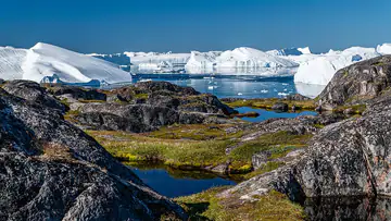
On a Mercator map, Greenland looks almost as big as Africa. In reality:
| Territory | Area |
|---|---|
| Greenland | 2.17 million km² |
| India | 3.29 million km² |
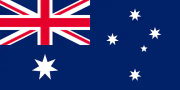
| Australia | 7.69 million km² |
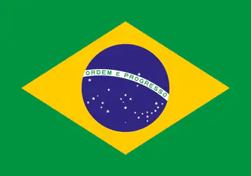
| Brazil | 8.52 million km² |
Greenland is about four times smaller than Brazil and smaller than India. Africa covers about 30 million km²: nearly fourteen times the size of Greenland.
The world’s big countries
| Country | Area |
|---|---|
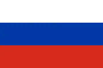
| Russia | 17.1 million km² |
| Canada | 9.98 million km² |
| United States | 9.83 million km² |
| China | 9.6 million km² |
| Brazil | 8.52 million km² |
| Australia | 7.69 million km² |
| India | 3.29 million km² |
| Argentina | 2.78 million km² |
| Kazakhstan | 2.72 million km² |
| Algeria | 2.38 million km² |
| DR Congo | 2.34 million km² |
Russia really is the largest country in the world, but Mercator exaggerates it too: it looks much bigger than the whole of Africa, whereas it is a little more than half its size. Canada, also far north, looks oversized as well.
Conversely, countries near the equator are underestimated: Brazil and DR Congo look modest on world maps, whereas Brazil is bigger than Australia and almost as big as the United States.
Deserts too
The Sahara covers about 9.2 million km², more than Brazil or Australia, almost as much as China or the United States. In the game, a “Sahara vs Brazil” duel catches a huge number of players.
Antarctica, the great distortion
On a Mercator map, Antarctica stretches into a huge white band at the bottom. In reality it covers about 14.2 million km²: more than Europe, but less than Russia (17.1 million km²).
How to stop getting caught
- Beware of countries near the poles (Greenland, Canada, Russia, Scandinavia): they are smaller than they look.
- Don’t underestimate the equator: Brazil, DR Congo and Indonesia are huge.
- Remember a few benchmarks: Russia ≈ 17 million km², the “big four” (Canada, United States, China, Brazil) between 8.5 and 10 million, Australia ≈ 7.7 million, India ≈ 3.3 million.
- Use a globe or an equal-area projection to compare visually.
Where the numbers come from
Areas are the official total values (land and inland water) published by national and international reference bodies. See our method.